Mikayla Peak
BLOG 06
Tuesday 10th September
Context
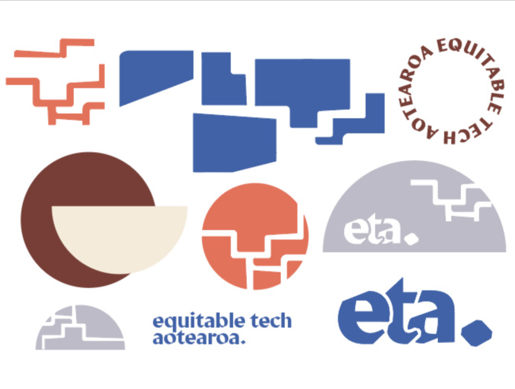
This week, I focused on developing a clear and cohesive brand identity for my project. With the growing complexity of the toolkit, I realised the need for a consistent visual identity that would not only make it more professional but also help me start to consider seriously the way I want to commuicate this toolkit. The brand needed to align with the core values of the project—equity, inclusivity, and innovation—while also ensuring that the toolkit is perceived as a credible and professional resource for organisations.

Action
To establish a strong brand identity, I began by creating a moodboard of my vision for the brand. I wanted the visual language of the toolkit to reflect the core themes of equitable technology and innovation, which is why I opted for clean, modern designs with warm tones. I also wanted the motif of a maze or map to be present throughout the design, representing the language of a ‘roadmap’.
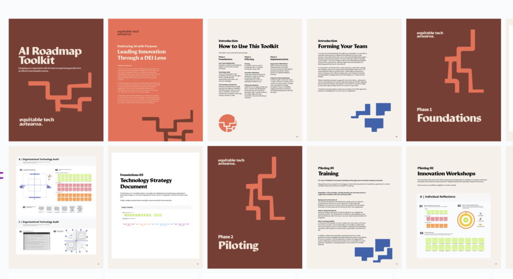
Once I solidified the branding, I applied it to the content I had developed over the past few weeks. This included polishing the first iteration of the toolkit with a more refined layout and a consistent design across all sections. Each section now has clear introductions and guidance for users, making the toolkit easier to navigate. I also added a note to leadership, highlighting their crucial role in driving equitable AI implementation. In addition, an appendix was created, containing policies, resources, and templates, which will help organisations customise the toolkit to their specific needs.

Result
The result of this week’s work is a more polished and cohesive iteration of the toolkit. With a clearer brand identity, the toolkit now feels more professional and user-friendly. The structured sections, each with a clear introduction, make the content more accessible for users to pick up and action. By including an appendix with additional resources and policies, I was able to create a toolkit that is not only practical but also adaptable for different organisations. However, this process highlighted the challenge of communicating the complexity of the toolkit effectively. While the visual branding enhanced the presentation, I realised that explaining the toolkit’s structure and purpose in a way that is straightforward yet comprehensive is more challenging than it initially seemed.
Learnings
One of the major challenges I faced this week was balancing the depth of the toolkit with the need for simplicity in communication. The toolkit is detailed, and while this makes it valuable, I had to be careful not to overwhelm users with too much information. This experience taught me the importance of thinking critically about how I present the toolkit to ensure it remains accessible without sacrificing its value. Creating a brand identity that simplifies and organises the content was a step in the right direction, but I recognise that I need to put more thought into how the toolkit is communicated, especially to different types of users. I still feel that creating a set of user personas could help guide this process.