Mikayla Peak
BLOG 08
Monday 7th October
Context

In week 7, my focus shifted towards developing an engaging website to present the toolkit in a way that not only reflects its value but also creates a seamless experience for users. With the toolkit being such a core offering, it was essential that the website not only looked polished but also guided visitors effortlessly towards downloading it.
Action


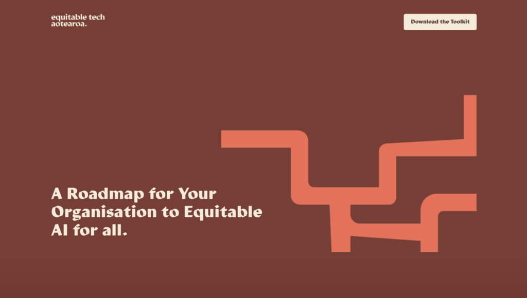
The website is structured as a single-page design, starting with a bold, eye-catching cover that introduces the toolkit’s purpose—providing a roadmap to equitable AI for all organisations. I chose a minimalistic design with strong colours and clear messaging to immediately engage users.
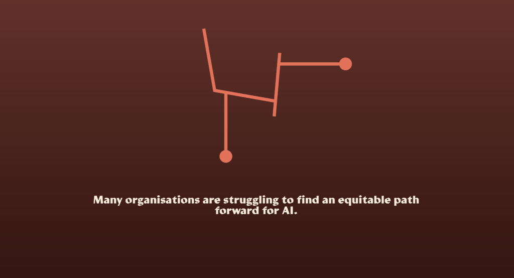
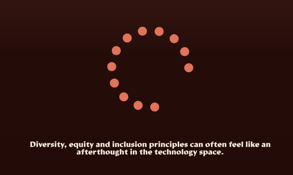
As users scroll down, they encounter small animations and headers that break up the content, keeping them engaged. These interactive elements are designed to keep the page dynamic, preventing it from feeling static or flat. The scrolling journey is simple but purposeful, culminating in a clear call-to-action: the option to download the toolkit. This helps drive engagement while keeping the user experience smooth and intuitive.
Result
The final design is both visually striking and functional. The strong colour palette and typography create a cohesive brand experience, while the single-page format ensures users can find what they need quickly. The animations and interactive elements have also added an extra layer of engagement, making the website feel polished and professional without unnecessary clutter.
Learnings
Building out the website highlighted how important it is to create a balance between aesthetics and functionality. While it’s tempting to add lots of visual elements, I found that simplicity is key to ensuring the user experience is seamless. The decision to incorporate subtle animations and focus on a strong cover image helped to draw visitors in without distracting them from the core goal—downloading the toolkit.
This experience also taught me that every detail counts when presenting a resource like this. From the way the headers are positioned to how the call-to-action is framed, everything plays a role in making the website feel cohesive and engaging.
Next week I will work to get the website live as it currently is just a local version.